Hopper Design Exercise
Check In
Introduction
Imagine we are designing a check in flow for users who have booked a flight on Hopper. Its purpose is to inform the user they can check in to their flight 24 hours before the departure time and to allow them to check in directly from the app. The goal is to provide a more full service flight booking experience for the user, and increase our repeat booking rate.User Research
In order to understand users’ behaviors when they check in by mobile slightly better, I’ve ran a small user interview with 10 potential users. They never used Hopper and checked in their flight by mobile within 3 months. I started our conversation with introducing Hopper first and asked these questions:- Have you used any apps to check in by mobile? If yes, what was the name and why did you use it?
- When you checked in by mobile last time, what was the most challenging part? And why?
- Where did you go when you checked in by mobile last time? Was there any problems?
- Did you save your boarding pass on a digital wallet such as Apple Wallet, Google Pay, and etc?
- Did you get any notifications to inform you that you were ready to check in? How did you get the message?
- Let’s say Hopper lets you find best flights deals, finish checking in, get mobile boarding pass, and notify you any updates about your flight. Would you use it? Why or why not?
In order to understand pivotal points of checking in from airline partners’ perspectives, I called 5 airlines which support mobile check in at the Zurich airport. Here are my questions:
- I am trying to book a flight and do you recommend me to check in before I go to the airport? Why?
- How early can I check in with my phone? Why?
- What key information do you need from passengers for checking in?
Interview Summary
Based on user interviews, 90% of people said there were several problems when they checked in by mobile. 70% of people set a self-timer for check in time. 30% of people used e-mail notifications for check in time. None used app notifications for check in time. Only 20% people said they use Apple Wallet to save boarding passes. 

Based on talking to airline partners, 80% said they suggest to check in as early as possible for assigning seats. None mentioned about checked bags or other reasons. We can only check in 24 hours in advance, because that is usually the most reasonable and accurate time to start their seating chart.
User Flows
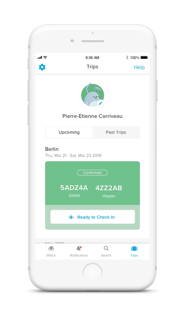
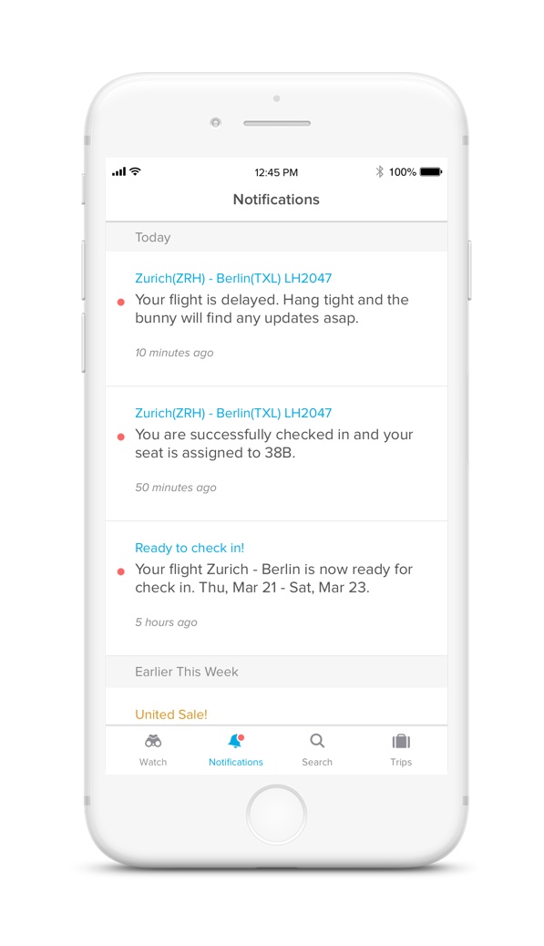
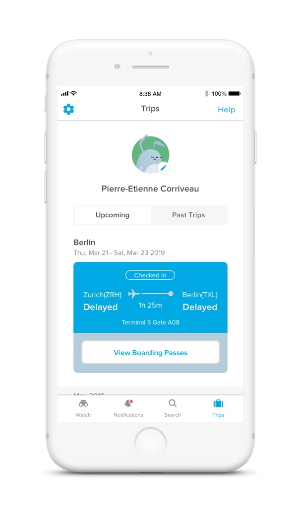
There are two user flows that I will design for the Scenario: Check In. First starts with the Trips tab and second starts with the Notifications tab, e-mail, or app notification.Trips
Within 24 hours before the departure to Berlin, Pierre wants to check in directly on the app.
Notifications
After Pierre got a check in notification, he wants to check in directly on the app.


Mobile Design


Next Step
Besides checking in, this exercise makes me think how Hopper users can communicate each other which will increase the app engagement and retention rates. For example, you can see other Hopper users who are at the same airport or booked the same flight. You can exchange real-time information such as gate change, report delay, waiting time, and etc. They can also meet up for a coffee at the airport. Back to checking in, I would repeat the process of getting feedbacks from peers, running user-testings, scrutinize users’ pain points, and adjust mock-ups accordingly.