I worked as a part of the Apple Marcom Team for two years who designs Apple online and Apple Store app. Here is one example of how I handled from a brief to production as a part of the Apple Watch Series 3 launch.
Apple.com
Apple Watch
There's an Apple Watch for everyone. Choose yours.
Challenge
Apple Watch is the first wearable tech from Apple that has the most customized options of what you are looking for. How can we help people to find their Apple Watch more efficiently? Understanding
Every Apple product, there is a clear distinction between marketing and retail. You learn about features and imagine how your life would be with marketing pages. Then you navigate through retail pages to learn more about specs, prices, and options to make sure you want to buy it. Now the question is, would this strategy work for Apple Watch? The answer was no. So we came up with a hybrid page that will be a bridge between marketing and retail for users. Exploration
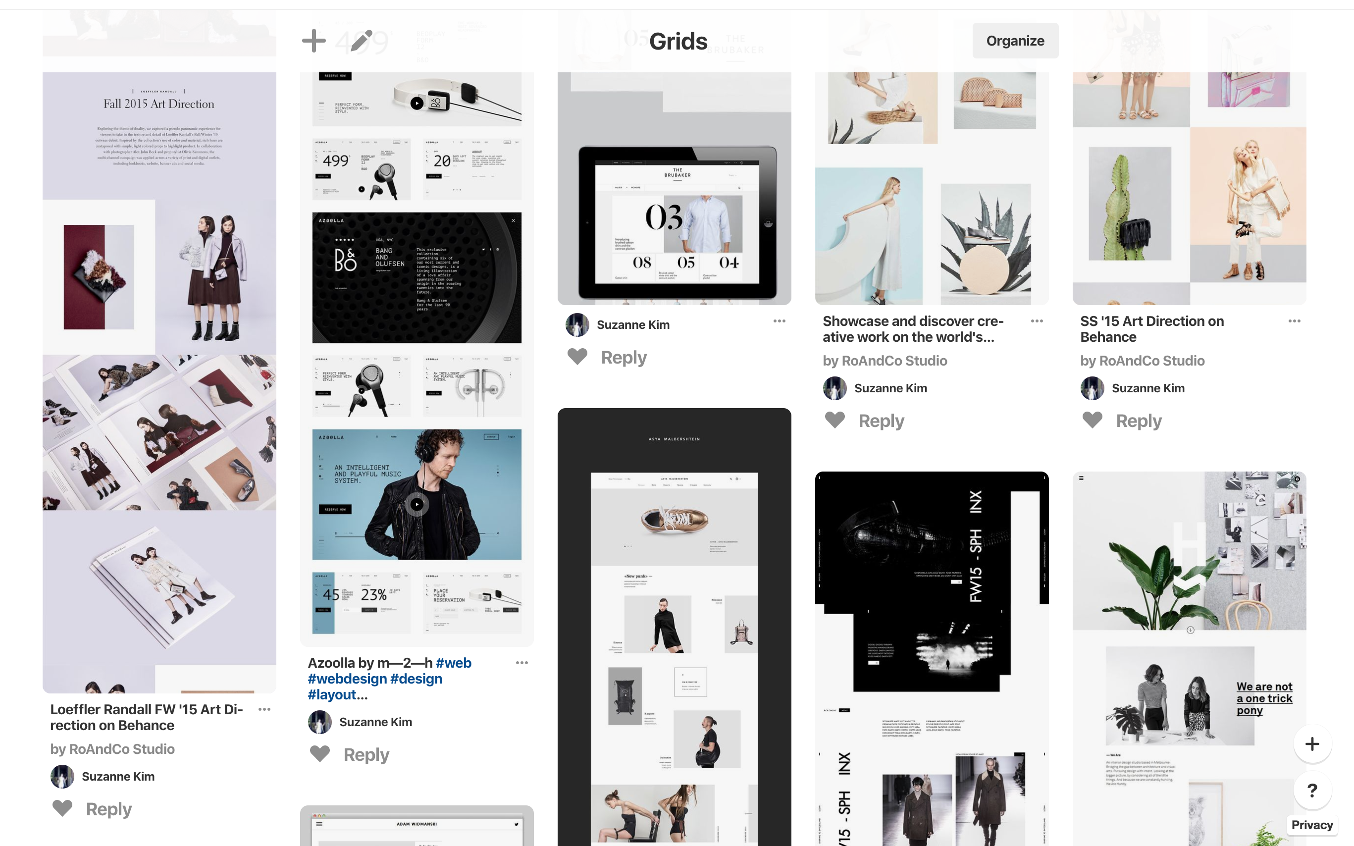
Which Apple Watch should you buy? Which model, size, case material, color, and bands are best for your needs and budget? With dozens of combinations available, the choice can be overwhelming. Here is my mood board on Pinterest for creating a grid wall. 
Product and Visual Design
As part of a small and agile team, we developed a versatile design solution that can be used for various types of Apple products, product imagery, and animations. Our design works seamlessly across all devices and global markets.View Website